For a book chapter I’m working on with Chris Harley and Mike Burrows, Iv’e been looking for the best graphics science has to offer that visualize Arctic sea ice loss. Here are a few contenders. Advice and other suggestions welcome.
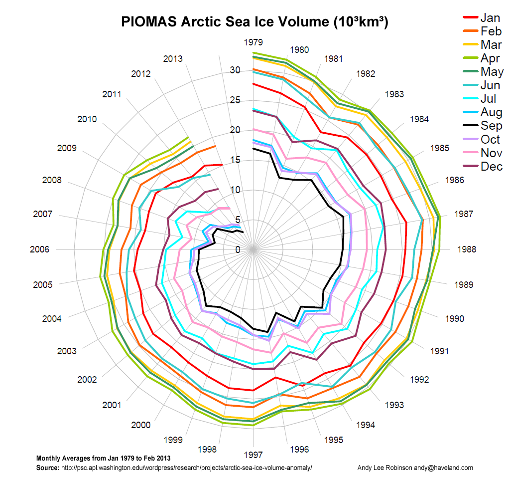
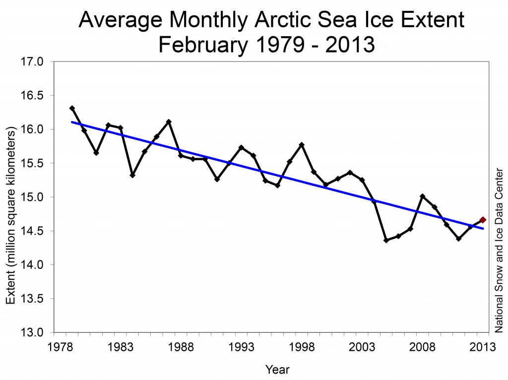
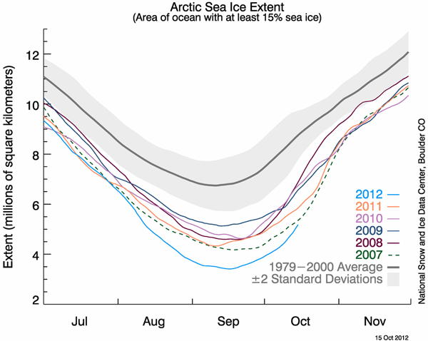
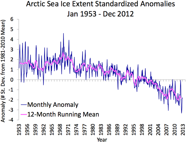
For a book chapter I’m working on with Chris Harley and Mike Burrows, Iv’e been looking for the best graphics science has to offer that visualize Arctic sea ice loss. Here are a few contenders. Advice and other suggestions welcome.
by
Tags:
Interesting graphs. I don’t really have Artic or ice cover data, but an impressive figure of greenland landmasses that are rising because of ice melting:
http://www.wired.com/wiredscience/2012/12/science-figures-2012/?pid=5587
and
http://www.pnas.org/content/109/30/11944.full
Christian
wow amazing graphics. and so cool that this effect is measurable to soon.
As a relative laymen, I find the top graphic the most visually arresting and immeditately informative. Not sure who the book’s aimed at, but if for the enthusiast / general public, just seeing an x / y axis can be a turn off!
Leave a Reply to Christian Cancel reply